Perfect Properties
Buying a house is such a difficult process with many hoops.
Buyers need to act fast to purchase a property, but understanding all the information on what to buy is overwhelming.
Overview
-
Objective
Perfect Properties simplifies the search process so that a buyer can choose a house quickly from a reliable source.
I am the UI designer for the project. This project took me 2 months.
The goal of the project is to build a mobile first responsive website.
I used Figma, Balsamiq, and Pen & Paper.
-

User Persona
Meet Rashida!
Persona Provided by CareerFoundry
-
Quote
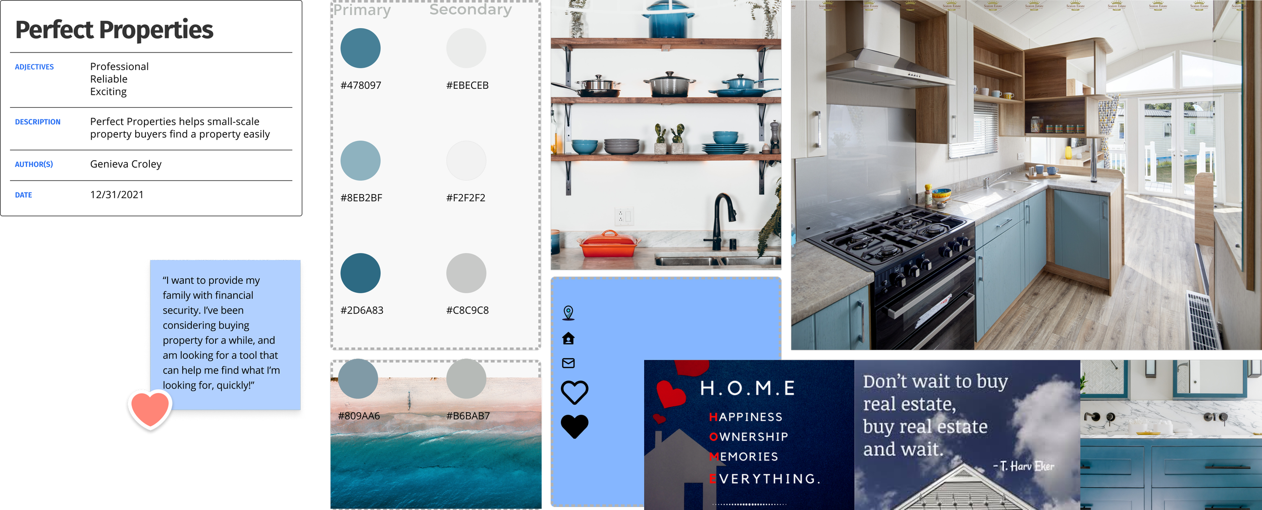
“I want to provide my family with financial security. I’ve been considering buying property for a while, and am looking for a tool that can help me find what I’m looking for, quickly!”
-
Goals
Rashida makes a good living and wants to invest in property beyond the city for increased financial security for her family.
She wants to find the right information for fast decision-making.
She wants a tool to help her find the right properties so as not to waste her time.
-
Tasks
As she is new to real estate, she wants a tool that is easy to use and that will help her find the property she’s looking for.
Search for properties, inputting criteria relevant to what she’s looking for
Easily view and return to listings she’s interested in
Receive relevant and comprehensive information about properties
User Journey
-

-
User Stories
As a user, I want to create a profile containing all my property criteria, so that I am recommended results most relevant to me.
As a user, I want to be able to search and filter properties, so that I can find good matches based on my needs.
As a user, I want to be able to save or mark properties I am interested in, so that I can easily revisit them.
Low Fidelity Wireframe
-

Pen & Paper
To simplify the process, I created an onboarding process that presents one question at a time. The profile questions are relevant to the user’s search.
In thinking about Rashida, she is both very busy and tech savvy. She might not want to provide detailed answers about her life to an app, but would like to specify her specific needs and wants.
I drew these wireframes on a flight.
-

Balsamiq
Using Balsamiq, I created my low fidelity wireframes to have a better since about the spacing of my components on mobile. The user can filter their selections and mark their favorite property.
-

Figma
In Figma, I used an 8-px grid and a 6-column with 16px gutters grid.
-

Profile Questions & Filters
Rashida has an option to fill out a profile that asks the fundamental questions of her basic search needs. She can also filter her searches as needed in a more detailed screen to further narrow or expand her criteria.
Mood Board
The Contestants
-
Winner!

-
Second Place

-

Winner!
I chose this mood board as the blue tones promote reliability and trust. Trust and reliability are imperative elements to our design as we are helping buyers with an expensive purchase.
-

Second Place
I created a green mood board to promote financial security. However, after applying the colors to my screens I found the theme to look to outdoorsy for the intent of the app.
Mid-Fidelity
-

Imagery
For consistency, I gave my buttons and field boxes a 8 degree curvature.
-

Filters
I added a map to my filters screen so that the users can select properties in a desired location.
I also simplified the profile questions and compiled the content to one screen. By simplifying this content, Rashida can set up a quick profile of her fundamental property needs, and then start searching.
-

Save It
Users can easily save their favorite properties by clicking the heart icon.
They can also save their searches so they can analyze different real estate criteria.
Choosing a Color Palette
-

Monochromatic Colors
Winner!
From my pictures in my mood board, I selected a blue color and created a monochromatic color scheme. This color scheme promotes reliability and trust.
-

Analogous Color
My analogous color scheme from my prime blue yielded rich purples that could give a luxurious feel.
However, for my application I wanted a more simplistic color scheme.
-

Triad Colors
The Triad color template presented green and purple colors which can gives us a feeling of abundance.
I think this particular shade of green reminds me of baby food, so I didn't stick with this color palette.
-
Monochromatic: The Winner!

-
Analogous

-
Triad

Final Mock Ups
-

In my final mock ups, I updated my screen layout so that when the screen expands, the screens maintain their visual hierarchy.
-

Responsive Web Design
Breakpoints at 375px, 768px, 992px
-

In configuring the breakpoints, I not only wanted to decipher at what breakpoint my configurations start looking bad, but what would Rashida being doing at this breakpoint. Perhaps, when she is using a tablet, she is multi-tasking, taking care of her family or watching Netflix.
-

Conversely, when she is on the desktop, she is possibly being more mindful in her search. Possibly.
Style Guide
Logo
-

Typeface
The headers in the application use the header font in white with contrasting primary color or contrast the primary color as a font on white background.
-

Logo
The logo uses the primary color and contrasting white. The logo is used to introduce the company, but not placed throughout the application.
-

Logo No-No's
Do Not use any other color, including colors that do not contrast well.
Do not compromise the legibility of the company name in anyway or distort the image.Description goes here
Typography
Brand Colors
-

Primary & Secondary
The Primary Color is used as a header and for all call to action buttons.
The Secondary Color highlights information pertinent to the listed properties.
-

Background & Font Colors
#04090B is used as a font color on the light background, #E4F1F6 and #FFFFFF. This color is not used interchangeably as a background and provides a high contrast ratio for visibility.
#E4F1F6 is a background color for field boxes and the Map/List View floating button. This color is never used as a font color.
#FFFFFF is used interchangeably as a font and background. This color is a font color for contrast on the Primary Color.
Icons
-

16px
The first row of icons are all 16px for the menu. The icons designate, Homepage, Favorites, Saved Searches, and Chat with an agent, respectively.
The second row of icons are also all 16px used to highlight information on the property cards. The information here shows square footage, virtual tour, number of baths, number of beds, and location, respectively.
The last row of 16px icons are dedicated for the sign up functionality.
-

32px
The 32px icons, the magnify glass and hearts, are used in the search bar and in the property cards for users to select their favorite properties.
Photos
-

Houses & Interior Design
House photos should include the entire facade of the house in the frame.
Interior Photos should include a wide enough frame to view the whole room.
-

Do Not
Do not use photos with pets, people, or anything that distracts from the property. Do not use photos that are cut off or do not appropriately display the entire house or room.
UI Elements
-

Buttons & Headers
The buttons use the primary color to guide calls of action. Less emphasized calls to action use the white background with the primary color stroke. Buttons have a 8 degree curvature.
-

Cards, Forms, & Menu
The property cards uses icons to distinguish the information so that the reader can consume the information at a glance.
The forms have a light blue background color to contrast the information from the rest of the content.
The menu uses icons to assist the user in understanding menu items content.
-

Maps
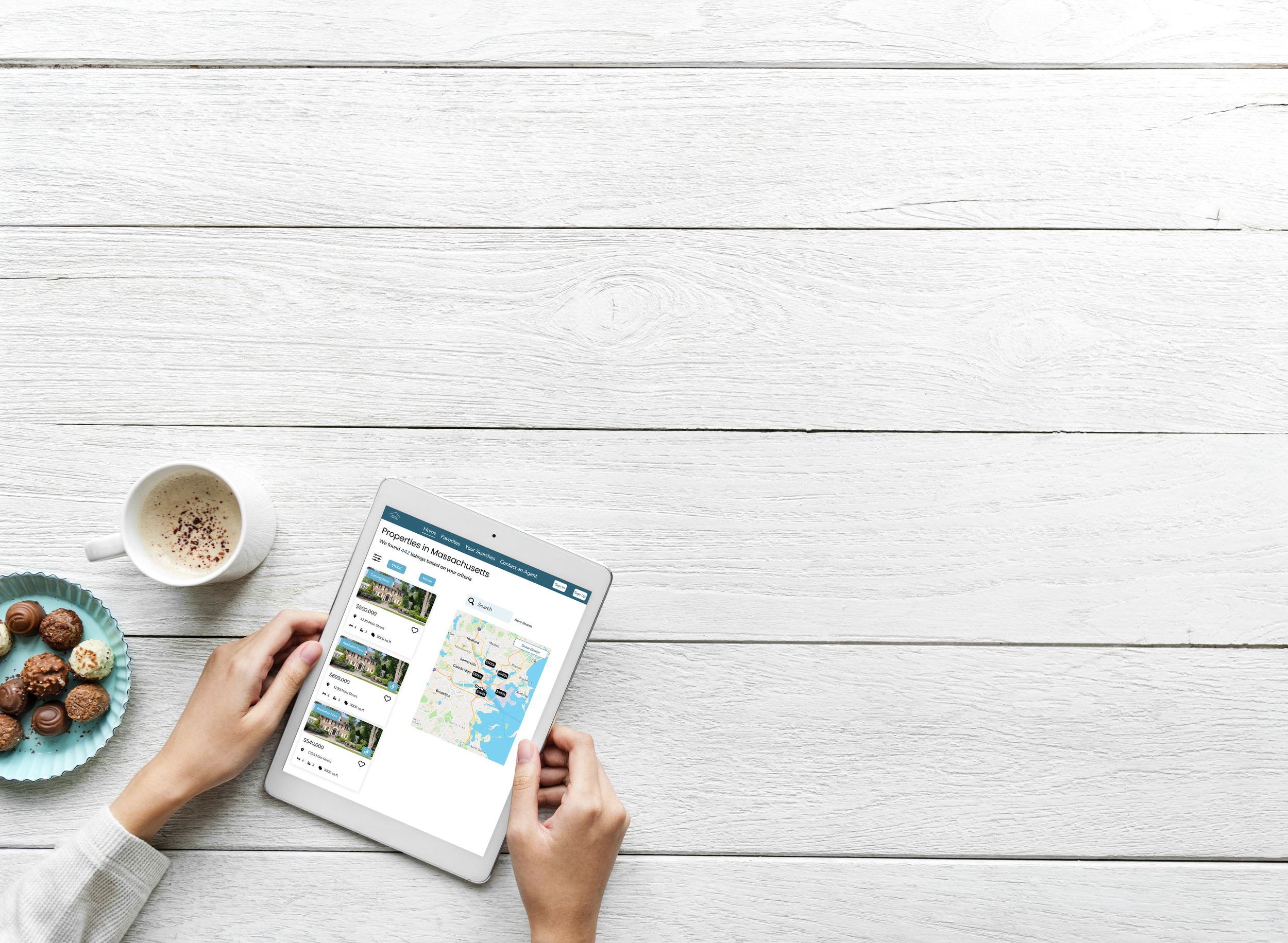
The user can look at a map or list view of the properties. The map view displays a price index of all the houses in the area.
Brand Guidelines
-
Perfect Properties
Perfect Properties uses monochromatic blues to promote trust worthiness and reliability. This application uses sans-serif fonts for readability and uses both verbal and visual instructions for clarity.
The tone of voice should promote professionalism and be concise. The voice offers the user a sense of ownership and use “Your Properties, Your Searches, Your Favorites”. The voice should also contain some excitement for the user making a big change.
Reflection
-
What I Learned
From building Perfect Properties, I have gained insights into using components and the 8-px grid. Using these tools helped me develop wireframes more efficiently. If I could go back and do it all over, I would conduct user research interviews from current home buyers to gain further insight into their struggles.
-
Next Steps
For my next steps, I will conduct user tests on my prototype to evaluate its usability and learnability. I also want to develop the properties listing page for a singular property and the map functionality.

